-Eric
Wednesday, November 12, 2014
Reviving the past.
It's been over a year. My life has changed a lot this last year. It's all been good, great even. I married my best friend, the most amazing and beautiful woman I've ever met in my life. We are in a very nice house, in a great neighborhood. I just got hired on at a local game studio doing quality assurance. Due to NDA I will not discuss anything from there on here, I will however, discuss a project that had it's official start date last night. The project is so new and ground level that there isn't even a name for it yet, or code name even. Yet, it exists, on the pages of Patch's notebook. Patch and I got together last night and started bashing out some details of a game that we had been discussing for a while. I will be posting some teasers of assets we create and some of the drawings that come from our meetings. Until more things are ironed out, that's all you get. We are aiming for pc release, no date yet, and if it is well liked... we will port it to mobile. This project will be at our leisure, after all we both have lives outside of this project. We will be building in Unity3d and modeling in Blender. I'm going to be getting my office set up and ready to start working this weekend on some prototypes, for the assets anyways. Maybe I'll sneak some up on here. 'Till then, I'm happy... it's alive!
-Eric
-Eric

Wednesday, March 13, 2013
The Master Sword Part 2
I started over. The hilt that I was making really didn't have much in the way of detail. So, after thinking it over, I figured out a much better (in my opinion) way of modeling the sword. This isn't the finished product, OK well it might be finished for a bit... But, I want to do custom textures for it. For now though, I give you my version of the master sword from The Legend of Zelda video game series.

You can see that I really took the time to add some detail. I'm NOT going for a realistic look here. This is just a cartoon style rendering. Later, once I created my own textures for it, I will try for realism. I learned how to do some pretty cool modeling tricks while working on this sword. Most of which were figured out through trial and error. I'm sure there are much better methods in existence that I am not aware of yet, however, it still worked all the same. This item would make a terrible game asset as it has over 5 thousand vertices. and it has a sub surf modifier on it set to 4.
-Eric
Monday, March 11, 2013
The Master Sword Part 1
This project is going to be broken down into several parts. I'd like to show how I get my final products. So for inspiration, I went browsing through Google Images. I knew that I wanted to model a weapon... but which one. Then, I saw it, glistening. The Master sword. I always loved Zelda games, ever since I was a little kid, 5 years old I believe.

This is the image that I am basing my design off of. It is not going to look exactly like this, this is just a reference. I'm going to try to texture the sword using only textures I create in GIMP. This is such a simple model, but I think taking my time and trying to perfect it is going to be a fun time. So let's get started...

This screenshot shows how I started the sword. I added a cylinder mesh. Using extrude and scale, I shaped the hilt to it's rough shape. Here you can see I still need to add tons of detail, however, this is still just a rough shape.

Here you can see that I finished the rough shape of the handle and begin to move further up the hilt. Slowly, I make the rough shape of the bottom portion. Extruding, scaling, and rotating each section as I go. This section took me a bit to figure out how I wanted to approach it.

In this screenshot I have to hilt shaped out, roughly. There is still tons of work to do to refine the shape further. This is before shading it smooth or adding any subsurf modifiers.

To make the blade, I added a plane to the mesh and shaped out the flat portion of the blade. Then, using extrude I added thickness to the blade. I then placed a loop cut around the perimeter of the edge and scaled/moved it outwards to create an edge/point.
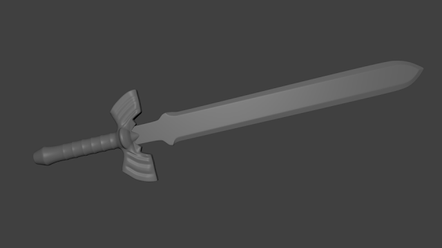
This is currently what the sword looks like. I've started the process of adding detail. In this render I have a subsurf modifier and smooth shading enabled. Next, on the to-do list, is more detail!
-Eric

This is the image that I am basing my design off of. It is not going to look exactly like this, this is just a reference. I'm going to try to texture the sword using only textures I create in GIMP. This is such a simple model, but I think taking my time and trying to perfect it is going to be a fun time. So let's get started...

This screenshot shows how I started the sword. I added a cylinder mesh. Using extrude and scale, I shaped the hilt to it's rough shape. Here you can see I still need to add tons of detail, however, this is still just a rough shape.

Here you can see that I finished the rough shape of the handle and begin to move further up the hilt. Slowly, I make the rough shape of the bottom portion. Extruding, scaling, and rotating each section as I go. This section took me a bit to figure out how I wanted to approach it.

In this screenshot I have to hilt shaped out, roughly. There is still tons of work to do to refine the shape further. This is before shading it smooth or adding any subsurf modifiers.

To make the blade, I added a plane to the mesh and shaped out the flat portion of the blade. Then, using extrude I added thickness to the blade. I then placed a loop cut around the perimeter of the edge and scaled/moved it outwards to create an edge/point.

This is currently what the sword looks like. I've started the process of adding detail. In this render I have a subsurf modifier and smooth shading enabled. Next, on the to-do list, is more detail!
-Eric
Thursday, March 7, 2013
Modern Gods
My second logo job. Doing this one for free, well mostly. I get to use some of their music later on for animations/games. Their name, Modern Gods. Check them out! They sent me some ideas and their current logo. My goal here was to spice it up a bit.

So I took the background logo there and created it in a 3d environment. Then using a Boolean modifier, I cut it out of a plane. I then created the text, using a different font. Gave it some depth and beveled the edges a bit. I made the material and texture for the text so that it would reflect the foreground while letting a tiny bit of color through from the back ground.

You can see in the above screen shot that there is a white plane hovering just above the camera. That plane is an emitter, which is what the text is reflecting back into the camera. The light in the background behind the black plane is going to be the source of the "god beams" or streaked light coming through the logo.

Their old logo was great, this one just pops a bit more. You can see the two lighter stripes on the text. Those are reflections from the plane that I had set up above the camera. I rotated it a bit and added a second plane for more effect. To get the light to shine through like this took a bit of settings manipulation. Once I found the right mixture it was just small tweaks to keep it from being over powering or way too blurry.
This item wasn't part of their request, but, I couldn't help myself. I just really wanted to animate a logo. I'm really happy with how it turned out. Some of it was pure accident but it works non-the-less.
-Eric
Wednesday, March 6, 2013
Local company logo
As a side job, I recently took a request to do a logo. This is the first logo I've done and the client was really happy with it! Here is the logo that I was given.

It's pretty good, the tribal fire on the bottom is asymmetrical, which I was asked to fix. I started out by setting up a plane with a mirror modifier on it. Once I got all the parts laid out except the head area, I went ahead and applied the modifier. Then, I got the head mapped out. Now that all the parts are in place, I added material and texture to them. I set up the materials and textures to mimic that of metal that had been painted with a semi gloss. In other words, a little shine with bright colors.

Here is the result of that work, it's completely flat and it is rather dark as I only have a single lamp on it. From here, what I did was thicken the logo. From flat to about the thickness of it's body section there, roughly. I took a metal floor texture from CG Textures, which if you have not already done so, sign up! It is all licensed resources you can use. I added a very bright light and a displacement modifier onto the new textured floor to create this.

Now it was time for the finishing touches. I adjusted the shadows that the light throws. There were a bit harsh and too perfect here. So I changed the number of samples and adjusted the softness. Then, to me, the floor seemed a bit to flat, too much like a picture. So I adjusted the displacement modifier to make it seem more like a metal floor with raised sections. The final render turned out better then I expected.

The floor looks like it is actually there and not just a picture. The shadow looks like it could have actually been cast by this logo and the metal is reflective and distorted enough to be believable. If you have any thoughts, comments, or suggestions, feel free to post them!
-Eric

It's pretty good, the tribal fire on the bottom is asymmetrical, which I was asked to fix. I started out by setting up a plane with a mirror modifier on it. Once I got all the parts laid out except the head area, I went ahead and applied the modifier. Then, I got the head mapped out. Now that all the parts are in place, I added material and texture to them. I set up the materials and textures to mimic that of metal that had been painted with a semi gloss. In other words, a little shine with bright colors.

Here is the result of that work, it's completely flat and it is rather dark as I only have a single lamp on it. From here, what I did was thicken the logo. From flat to about the thickness of it's body section there, roughly. I took a metal floor texture from CG Textures, which if you have not already done so, sign up! It is all licensed resources you can use. I added a very bright light and a displacement modifier onto the new textured floor to create this.

Now it was time for the finishing touches. I adjusted the shadows that the light throws. There were a bit harsh and too perfect here. So I changed the number of samples and adjusted the softness. Then, to me, the floor seemed a bit to flat, too much like a picture. So I adjusted the displacement modifier to make it seem more like a metal floor with raised sections. The final render turned out better then I expected.

The floor looks like it is actually there and not just a picture. The shadow looks like it could have actually been cast by this logo and the metal is reflective and distorted enough to be believable. If you have any thoughts, comments, or suggestions, feel free to post them!
-Eric
Tuesday, March 5, 2013
Paradise on this snowy day.

This scene was an absolute blast to make. There are several aspects here that I've never incorporated into my work. First of all, some high detail textures, all of which are taken directly from Google Images. I claim no ownership of the textures. Secondly, water! Oh, sweet, translucent, reflective, succulent water. I have not learned how to render water physics yet. This was very simple to create. I made a plane and scaled it to fit the gap between the sand and the background plane. Then I used a solidify modifier to give it some depth. Then, taking the material for the plane, I made it translucent and reflective while giving it a blue hue.

The first asset I created for this scene was the hut. It only contains 2 shapes, a cone with the bottom face removed and a cylinder with the top face removed and a couple of panels removed to make the opening. I didn't add any thickness to the hut because I was looking to make a semi-real/mostly cartoon scene.

The palm tree actually took me quite a while to figure out what to do for the leaves. The trunk was easy, just take a cylinder and extrude it a couple of times, then scale it and rotate it how you see fit. The leaves I left flat to save on geometry and also to keep the cartoon look. The leaves were just a plane that I bent and cut to make jagged leaves. Then, it was just a matter of duplicating and rotating to get them into place.

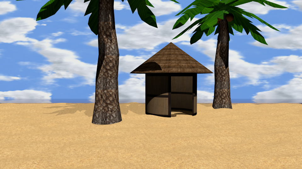
These are just some different shots of the same scene from multiple angles. I really had a great time working on this scene.
-Eric
Edit: Looking at the scene I found an issue that I had overlooked. I left the palm trees emitting a small amount of light and they were not smooth shaded. So, making these changes here is the final render! Enjoy, and please feel free to let me know what you think!

Edit 2: Thanks to Masterxeon1001, here is a new final render. He suggested I edit the soft value on my lighting and use the ocean modifier instead of a normal plane. What do you think?

Monday, March 4, 2013
Taking flight.
Today I decided to work on sky domes. It was relatively simple, the hardest part was finding a good "sky". That's where good ole Google Images came into play. I found a decent one to use. I started off by creating a sphere mesh and then removing the bottom half. Then, adding in a plane to create the ground, I slowly moved the two together so there were no gaps. I added the sky texture to the sphere and then flipped the normal's creating a dome over the scene which contained the sky and the ground. I then placed a lamp and a camera inside the dome and started working on the grass particles. To break up the ground a bit I used the displacement modifier and then smoothed it out quite a bit. To further break up the ground I created another plane in a different work space. I then subdivided it and smoothed it out. Once again, using the displacement modifier, I created a nice jagged rock. Adjusting the material and texture, so it has some depth, then sub surfacing the rock to smooth it out further. Then it was just a matter of moving it to the first work space and sizing it to fit the scene. I decided I wanted to try to add something else to the scene to make it fun. So I headed over to Blend Swap and found a nice bird made by Spirit. All credit for the bird goes to him. All I did was re-size and move him. All these things combined made this fun little scene for me. Please, if you have any suggestions please feel free to offer them!
-Eric

-Eric

Friday, March 1, 2013
Our first frontier.
So, I was a little bored today and decided to play with texture mapping on a sphere. It was a lot easier then I thought. The geometry is simple enough. It's just a sphere and I made a little flying saucer for fun. which was a torus and half a sphere. The stars were created using the world settings.


-Eric
EDIT:
I got the geometry to smooth out and the light to stop reflecting! woot!

Much better.

Then I proceeded to take screen shots of the renders while moving the camera about for different effect. What I really need to know is, how do I make the geometry not show through the mapping? Also, how do you minimize the reflection of light on the mapping, for example, real earth won't reflect the lamp on it....

I really liked this little project. I think I would like to work on this a bit more another day. It would be fun to make a solar system animation with the camera zooming and weaving in and out between the planets then crashing into the sun.

This one, I purposely left the lamp on the other side of the earth to show the "night/day" style picture. Makes it look like the sun is about to rise on this watched portion of earth.

All in all, I really enjoyed this little project. If you have any ideas or advice on how to solve the issues mentioned above, please let me know via comment!
EDIT:
I got the geometry to smooth out and the light to stop reflecting! woot!

Much better.
Thursday, February 28, 2013
Springing back to life.
Sadly, it has been too long. I've been searching for motivation and time to start working towards my goal. Learning all things game design. In my absence I have spent many hours learning and reading about java programming. Neglecting Blender, I decided today to work on a scene that was inspired by the desire for spring. Not that I dislike winter, that is not the issue at all. I just am really looking forward to the joys and outdoor fun that comes along with spring. With that being said... Let's get into the project...


This is basically the finished project, as it has been a while and I forgot to take screen shots. However, I can still illustrate the process. The first thing I did was created a basic plane. Then using subdivision surface, I made 5 cuts. Next, I took the plane and added a sub-surf modifier onto it. I then created a material for the ground and gave it a dark brown, non-reflective color. Once that was finished I created a texture for the displacement modifier. Now, I don't remember exactly what settings I adjusted to get the rolling hills look.

In this image you can see that I cut away the majority of the original plane. This lightens the load on the computer quite a bit and since the audience only sees what the camera sees, then it is not required to have the rest there. Once the displacement modifier was all tweaked, I moved on to the grass. Using hair particles and tweaking the settings once more, I created the rolling grass-covered hills you see here. I will do a more thorough walk through later. Enjoy!
-Eric

Tuesday, February 12, 2013
Learning Java and playing with Blender
I have 2 new books on my Nook, both dealing with learning Java. I'm really liking the learning process for Java so far. I mean, it has just been mostly reading and looking at other authors code... but still interesting non the less. I'm starting to develop an idea of what I need to do in order to get things rolling in the right direction this time. I have neglected my Blender training, which I need to get back into.... There is so much I want to do but it seems that everything is being bottle necked by trying to learn as much as I can. I think, with Blender I will just work on modeling on my own instead of trying to continue learning more about it, until a later date. Then, using up my "learning time" on Java.
I'll start posting some more models here soon, I'm thinking about doing a "Monday, Wednesday, Friday" modeling session. Something small each day to advance my modeling skills. Once I get to where I am modeling quickly and cleanly, I can start to add backgrounds or create scenes, maybe even animate a bit.
As far as Java goes, I'm thinking that once I start learning to make some programs, I'll get links to them posted here. I'm thinking about doing some coding videos along with the animation videos. Maybe show the code for a simple game and then show the game, with a download link in the description. Could be fun.
-Eric
I'll start posting some more models here soon, I'm thinking about doing a "Monday, Wednesday, Friday" modeling session. Something small each day to advance my modeling skills. Once I get to where I am modeling quickly and cleanly, I can start to add backgrounds or create scenes, maybe even animate a bit.
As far as Java goes, I'm thinking that once I start learning to make some programs, I'll get links to them posted here. I'm thinking about doing some coding videos along with the animation videos. Maybe show the code for a simple game and then show the game, with a download link in the description. Could be fun.
-Eric
Wednesday, January 30, 2013
Shift in focus.
So, with the lack of interest in a platform game... I'm going to re-devote myself to learning all things game design with a focus on modeling and animation in Blender for the time being. That is where I have to most fun. I think that, maybe, I jumped ahead of myself. I got myself all worked up and excited to start on a game and then was let down by the underwhelming response. Though, looking back, I shouldn't care what happened as it was a project for me (and if it got good reviews, well that is great too). However, it kind of stopped being fun for a bit.
Now taking a month break and realizing that there is still tons of stuff that I can learn and work on, it gives me new motivation to continue with this blog and with my dream. This blog is still devoted to learning game design, as is my YouTube channel. However, you might see some fun projects sprinkled throughout. Now, with that being said...
Now taking a month break and realizing that there is still tons of stuff that I can learn and work on, it gives me new motivation to continue with this blog and with my dream. This blog is still devoted to learning game design, as is my YouTube channel. However, you might see some fun projects sprinkled throughout. Now, with that being said...
ONWARD!
-Eric
Wednesday, January 2, 2013
More than a walk...
First of all, I know it is a day late, Happy New Year! Now that the social niceties are out of the way... back to Blender! For the first time in my Blender exploration and execution, I go beyond the normal "walk cycle test". Why, because it is boring. I wanted to see how I dealt with the real world problems, like front flips. Using my Minecraft character from the previous blog post, I created a small little scene for him to play in. Using a basic plane and then subdividing it out about 5 times to create the base for the scene is the path I choose. From there you can pick random faces to extrude for hills and trees. Keep in mind this is just a very basic attempt at Minecraft animation and I hope to make a better one later on. Mostly because the small scene I created doesn't really leave much room for camera work or character movement. I made the scene in a bit of a hurry, sorry, I was excited to get into the animation portion. I promise the next scene will be much better, also, I'll fix the textures there too!
This was a lot of fun to make and I cannot wait to start working on the next scene. Animation is part of game design, a part which I am truly excited to work on some more. Any thoughts or ideas are always appreciated! Sorry for the short post, but, I'm going back to work with Blender some more! The next post will have some screen shots of the creation process.
EDIT: Just figured out how to fix the shadows not appearing, special thanks to tacodrake95 from the /r/blender community! Sadly, I had already rendered this trial video. The next one will have shadows!
-Eric
This was a lot of fun to make and I cannot wait to start working on the next scene. Animation is part of game design, a part which I am truly excited to work on some more. Any thoughts or ideas are always appreciated! Sorry for the short post, but, I'm going back to work with Blender some more! The next post will have some screen shots of the creation process.
EDIT: Just figured out how to fix the shadows not appearing, special thanks to tacodrake95 from the /r/blender community! Sadly, I had already rendered this trial video. The next one will have shadows!
-Eric
Friday, December 28, 2012
More, a texturing and animation story
Well, Christmas is over and it is time to get back to work learning Blender. Taking some time today to learn texturing and animation. I know this topic is way over done, however, it is an easy character to make and texture. Deal with it. I decided to make my very own Minecraft Steve. For those of you who are not familiar with Minecraft, Steve is a cube based character with 8-bit graphics. This makes him very easy to model as well as texture.

This screenshot shows me finalizing the armature after making the very basic mesh for Steve.You can see that I have not parented the bones in the arms and legs to the main spine bone yet. Fret not, I did it. Anyways, a very basic armature for a very basic mesh, though I did learn how to go in and edit vertex groups for individual bones. The leg bones where effecting the body and the head was effecting the arm... it was very strange, but it is now fixed.

After adding the armature and then parenting the mesh to it, I decided to work on marking seams for the UV unwrap portion. Since all the body parts are essentially cubes, this process was very simple. All I did was take the front face on each part and mark the 4 edges coming off towards the back, then you just mark the 3 seams in the back and it unwraps very nicely.

Here is the initial UV unwrap displayed in the UV image editor. After this screen shot I placed all the that were the same on top of each other. For instance, since both arms are going to look the same I rotated and located one arm so that it fit perfectly on top of the other. Then, I did the same for the legs. The head was scaled up to allow for more detail, as was the body.

Using G.I.M.P., an open source image editor (similar to PhotoShop) I loaded the UV unwrap and proceeded to paint the texture. I have a fondness for cartoon textures and it just so happens that Steve wanted a custom cartoon texture. I'd go into explaining how I used G.I.M.P. with all the layers and such, but, this is a Blender/Game design blog. Anyways, after all the painting was done, I added a blur to make the image look pixelized. Then, export it as a .png file and load it back into Blender.

I had to kind of cheat this image, since the original used a very poor and quickly done texture that I decided to throw away. So here is me showing the new texture loaded into Blender with Steve showing it off in style. Actually, in this picture you can see me working on the animation that will be shown in the next blog! I'm going to make a little Minecraft animation to finish off this project.

Here is a sneak peak. It is far from finished, however, I wanted to see what he looked like rendered. Incidentally, does anyone know how to make this model project a shadow onto the image textured ground that he walks on? I cannot seem to accomplish this task. Any help would greatly be appreciated.
-Eric

This screenshot shows me finalizing the armature after making the very basic mesh for Steve.You can see that I have not parented the bones in the arms and legs to the main spine bone yet. Fret not, I did it. Anyways, a very basic armature for a very basic mesh, though I did learn how to go in and edit vertex groups for individual bones. The leg bones where effecting the body and the head was effecting the arm... it was very strange, but it is now fixed.

After adding the armature and then parenting the mesh to it, I decided to work on marking seams for the UV unwrap portion. Since all the body parts are essentially cubes, this process was very simple. All I did was take the front face on each part and mark the 4 edges coming off towards the back, then you just mark the 3 seams in the back and it unwraps very nicely.

Here is the initial UV unwrap displayed in the UV image editor. After this screen shot I placed all the that were the same on top of each other. For instance, since both arms are going to look the same I rotated and located one arm so that it fit perfectly on top of the other. Then, I did the same for the legs. The head was scaled up to allow for more detail, as was the body.

Using G.I.M.P., an open source image editor (similar to PhotoShop) I loaded the UV unwrap and proceeded to paint the texture. I have a fondness for cartoon textures and it just so happens that Steve wanted a custom cartoon texture. I'd go into explaining how I used G.I.M.P. with all the layers and such, but, this is a Blender/Game design blog. Anyways, after all the painting was done, I added a blur to make the image look pixelized. Then, export it as a .png file and load it back into Blender.

I had to kind of cheat this image, since the original used a very poor and quickly done texture that I decided to throw away. So here is me showing the new texture loaded into Blender with Steve showing it off in style. Actually, in this picture you can see me working on the animation that will be shown in the next blog! I'm going to make a little Minecraft animation to finish off this project.

Here is a sneak peak. It is far from finished, however, I wanted to see what he looked like rendered. Incidentally, does anyone know how to make this model project a shadow onto the image textured ground that he walks on? I cannot seem to accomplish this task. Any help would greatly be appreciated.
-Eric
Friday, December 21, 2012
Coins, new mechanic introduction!
I'm adding an element of difficulty to the game. Each level will start with a very short amount of time to complete it. Fret not, each level will house several gold coins to increase the amount of time you have to complete it. They won't be hard to get to, but you do have to work at them... for example, you might have just enough time to reach the first coin, so any screwing around and it's game over for you!

The coins were really simple to make. First off, I added a circle mesh. Then extruded the circle directly back to give it thickness. Then using extrude and scale, I created the lip of the coin before it goes into the dip. Then, extrude and scale once more to bring the coin in on itself to give it depth. Then just highlighting the newly formed inner ring and pressing the "f" key to fill in the missing faces.
I've done some work on the first level and decided to take some screen shots as I progressed.

This is the first in the series. Not much to see really, just kind of giving you an idea of the scale of the first level. On the far left you can barely make out the humble beginnings of level 1. At this point I was still in the planning and experimenting stage.

Here you can see I added in some jumps and a pitfall. The pitfalls are a fun little obstacle that seem to pop up in all kinds of games. From this perspective you can see how I create the 3d effect inside of a 2d game. By placing the camera into orthographic mode it allows me to place things in the foreground and the background while both still appear to be on the same plane. As the character runs through the game along the cleared center path visible in the above picture, he passes behind the trees in the foreground and in front of the trees in the background, giving the illusion of 3d.

Another orthographic view, just giving an idea of how much of the level is finished. The little cross in the middle of the screen is the center of the level. I'm about a quarter of the way done in this image. You can see in this screen shot that I have added another platform after the pitfall and added the trees and grass where needed.

This is an awesome view. I deleted the back and bottom of the level as they were added geometry that was not necessary. In this screen shot you can see a second pitfall and some more trees added. Each level is going to have a different feel to it. This one is outdoors and forest sort of feel. I've already had a request for an alien level, can't wait to work on that one! Everyone needs to check out this site for amazing music that is royalty free! I cannot even begin to tell you how much I love this site. It is wonderful!
In this video I show what coins are going to look like in the game as far as movement and color is concerned. Also, it will go onto my kick starter project as fun additions while it is posted and accepting contributions. I'll get the link on here and all the other blog posts as soon as it is green lighted by Kickstarter. As always, please leave comments and suggestions!
-Eric

The coins were really simple to make. First off, I added a circle mesh. Then extruded the circle directly back to give it thickness. Then using extrude and scale, I created the lip of the coin before it goes into the dip. Then, extrude and scale once more to bring the coin in on itself to give it depth. Then just highlighting the newly formed inner ring and pressing the "f" key to fill in the missing faces.
I've done some work on the first level and decided to take some screen shots as I progressed.

This is the first in the series. Not much to see really, just kind of giving you an idea of the scale of the first level. On the far left you can barely make out the humble beginnings of level 1. At this point I was still in the planning and experimenting stage.

Here you can see I added in some jumps and a pitfall. The pitfalls are a fun little obstacle that seem to pop up in all kinds of games. From this perspective you can see how I create the 3d effect inside of a 2d game. By placing the camera into orthographic mode it allows me to place things in the foreground and the background while both still appear to be on the same plane. As the character runs through the game along the cleared center path visible in the above picture, he passes behind the trees in the foreground and in front of the trees in the background, giving the illusion of 3d.

Another orthographic view, just giving an idea of how much of the level is finished. The little cross in the middle of the screen is the center of the level. I'm about a quarter of the way done in this image. You can see in this screen shot that I have added another platform after the pitfall and added the trees and grass where needed.

This is an awesome view. I deleted the back and bottom of the level as they were added geometry that was not necessary. In this screen shot you can see a second pitfall and some more trees added. Each level is going to have a different feel to it. This one is outdoors and forest sort of feel. I've already had a request for an alien level, can't wait to work on that one! Everyone needs to check out this site for amazing music that is royalty free! I cannot even begin to tell you how much I love this site. It is wonderful!
In this video I show what coins are going to look like in the game as far as movement and color is concerned. Also, it will go onto my kick starter project as fun additions while it is posted and accepting contributions. I'll get the link on here and all the other blog posts as soon as it is green lighted by Kickstarter. As always, please leave comments and suggestions!
-Eric
Thursday, December 20, 2012
Kickstarter, all or nothing!
Well the time has come. Having a month of serious Blender focus and several months of goofing off with it, it is time to take on a project. I've already done some work on Roundy's Adventure, so it's time for that work to be put together into a Kickstarter project. I've been working on setting up the project for a few days on and off. I have already met/completed all the requirements, and I'm well on my way to having a very nice project set up. So with all that said, I present to you... Roundy's Adventure Teaser Videos!
A short little video compiling everything that is done up to this point. Most of the material is going to look familiar, as it has been published piece by piece here on my blog. This video is what I'm submitting as my project video on Kickstarter. I'll post a link to the project after it goes through the evaluation process. Once that occurs the project is ready to accept backers. Each backer then picks a price level and gets rewards when the game is released. Each backer will get a copy of the game, regardless of price point purchased.
This is a short blog post, mostly to promote the new video and to post about progress being made. The first level of Roundy's Adventure is half way finished! I added some pitfalls, similar to Mario Brothers, which will reset you to the beginning. The game is harsh like that, but, I feel like it is more rewarding to complete it in one go... instead of dying and starting right back where you left off. I'll snag some screen shots of the first level as I work on it for the next post. I can talk about how it was created and what the geometry looks like right now. Till then, I hope everyone has a wonderful day!
-Eric
A short little video compiling everything that is done up to this point. Most of the material is going to look familiar, as it has been published piece by piece here on my blog. This video is what I'm submitting as my project video on Kickstarter. I'll post a link to the project after it goes through the evaluation process. Once that occurs the project is ready to accept backers. Each backer then picks a price level and gets rewards when the game is released. Each backer will get a copy of the game, regardless of price point purchased.
This is a short blog post, mostly to promote the new video and to post about progress being made. The first level of Roundy's Adventure is half way finished! I added some pitfalls, similar to Mario Brothers, which will reset you to the beginning. The game is harsh like that, but, I feel like it is more rewarding to complete it in one go... instead of dying and starting right back where you left off. I'll snag some screen shots of the first level as I work on it for the next post. I can talk about how it was created and what the geometry looks like right now. Till then, I hope everyone has a wonderful day!
-Eric
Wednesday, December 19, 2012
Trees, grass, and levels! Oh my.
Judging by the title, one can safely assume that I've been busy. It is true, today I started modeling some more assets for Roundy's Adventure. Also, I started working on the first level! I'll get to that later, for now we will talk about planning out the levels prior to starting them. Now this should come as no surprise, but let me tell you from experience. It is so hard to force yourself to sit down and plot out a level when in just a few clicks you can have Blender up and running. Sketch it, write about it, outline it, just do whatever to plan it. You will save yourself a lot of time and headache. I will admit, I was the type to just jump on Blender and start throwing junk together... and that is exactly what I got, junk. Today however, was different. I did some thinking to figure out what this level is going to look like and decided exactly what assets I would need to model. Also, I decided to use only Blender materials and textures for my first game. Part of it is because I'm lazy and the other part is because I would like to learn G.I.M.P. better first.

This is the first asset I would like to talk about. It just tall grass. Nothing special, but it is very low poly so it is easy to duplicate and stagger to give the illusion of bunches of grass. To make this piece I just added the default plane and subdivided it twice. Then using the extrude tool, I grabbed the inside edges and added some rotation and scaling to give them the shape you see here.

For the second tall grass model I took the first one and just moved some of the edges around. It tiles up great next to the first one. For the material and texture I did a green diffuse with shade-less checked. Then added a texture and sized it up so the stripes were more "random" looking. It creates a neat little effect when it is placed sided by side with duplicates of the other grass.

This asset is, obviously, a tree. I started with a cylinder. Scaling the base out and scaling next ring in, it gives the illusion that the tree in starting to spread out for the roots. Then just using extrude and scale I formed the rest of the trunk. For the leaves I extruded then scaled out and then grabbed the edge and brought it down a bit. From there extrude and scale to bring it back up to form the leaf ball at the top.

This is the other tree I have ready for this level. It is the same tree as above but I altered the trunk a bit. The cool part about these trees is that they can be scaled along an individual axis, thus changing the shape and making a unique tree. The texture and material on these trees was done similarly to the grasses. The difference is, the trees accept shadows so they appear to be 3D.

This screen shot shows the humble beginnings of the first level from Roundy's Adventure. I have a rig that follows the camera and contains all the lighting for the level. The camera is set to orthographic to make the game 2D. You can see the big blue background that is just a simple plane. Unfortunately you cannot see the textures that are applied in this image, but I've got a render coming up that will show you all that.

Here is a sneak peek of the first level! You lucky bastards! I can't wait to work on this some more. The whole process (learning, experimenting, playing, creating) has been an amazingly fun time. I want to get a sample level ready in about a month or so. Having that ready and filmed will really help when I try to get Kickstarter going. Well, I hope you enjoyed the sneak peek and I look forward to some comments and advice!
-Eric
Blog claim token: 7EDHYZXX22MB

This is the first asset I would like to talk about. It just tall grass. Nothing special, but it is very low poly so it is easy to duplicate and stagger to give the illusion of bunches of grass. To make this piece I just added the default plane and subdivided it twice. Then using the extrude tool, I grabbed the inside edges and added some rotation and scaling to give them the shape you see here.

For the second tall grass model I took the first one and just moved some of the edges around. It tiles up great next to the first one. For the material and texture I did a green diffuse with shade-less checked. Then added a texture and sized it up so the stripes were more "random" looking. It creates a neat little effect when it is placed sided by side with duplicates of the other grass.

This asset is, obviously, a tree. I started with a cylinder. Scaling the base out and scaling next ring in, it gives the illusion that the tree in starting to spread out for the roots. Then just using extrude and scale I formed the rest of the trunk. For the leaves I extruded then scaled out and then grabbed the edge and brought it down a bit. From there extrude and scale to bring it back up to form the leaf ball at the top.


This screen shot shows the humble beginnings of the first level from Roundy's Adventure. I have a rig that follows the camera and contains all the lighting for the level. The camera is set to orthographic to make the game 2D. You can see the big blue background that is just a simple plane. Unfortunately you cannot see the textures that are applied in this image, but I've got a render coming up that will show you all that.

Here is a sneak peek of the first level! You lucky bastards! I can't wait to work on this some more. The whole process (learning, experimenting, playing, creating) has been an amazingly fun time. I want to get a sample level ready in about a month or so. Having that ready and filmed will really help when I try to get Kickstarter going. Well, I hope you enjoyed the sneak peek and I look forward to some comments and advice!
-Eric
Blog claim token: 7EDHYZXX22MB
Tuesday, December 18, 2012
Wishing for a winter wonderland...
Well, it is almost that time. I don't know about the rest of you all but I'm ready for snow! So, obviously, I've modeled Santa Claus. Now, this is actually one of the hardest models I've done to date. The beard and the different colors on the body made for an interesting time. I learned how to contour the geometry to the body flow while at the same time making it possible to add in features. I did a simple Google Images search and found tons of reference photos for this project.


I started out with your basic cube. Then subdividing and cutting it in half, I added a mirror modifier and a subsurface modifier. Then using extrude, scale, and grab I modeled it further into the beginning shape you see here. I'm referencing it off of the picture that I have set to the background in orthographic perspective. I have my default Blender screen set up a bit different then the standard setup. I like having the timeline and dope sheet out with the camera preview in the bottom right. Just makes my animation flow better, I guess I could make a better setup just for modeling, some day.

Here is Santa Claus with a little more finished. Here I started adding color to the mesh and playing with the specular settings to get the clothes and skin to look right. Shinier for metal and dull for clothes. At this point the mesh is still only half as I have not applied the mirror modifier. Shortly after this I had a crazy issue that caused about an hour of confusion. Some how I managed to set the origin of the model to some bizarre location which in turn caused the model to mirror on his back. After figuring it out and changing the origin it made things a little weird but I was able to finish the project with minimal stress.

Here is the scene that I had setup for the final render. I made a little "north pole" looking object to add some depth. The plane on the ground was setup to look like snow. I did some playing around in the world tab. I set the sky to be dark blue with some stars to make it look like snow is falling a little bit.

Here is the final render. It is nothing to crazy but it took me a while and I really like how it turned out. I need to work on setting up the scene a little better in the future. I've got Santa Claus rigged up, I might do some animations with him later on. I found a really simple model on the Blend Swap website, that someone made. I downloaded it and started adding some color and rigging for some fun later on. Here is what I got so far on that project.

The model was made by Artboy92, he did a pretty good job! I can't wait to mess with this some more. Seriously though, go to Blend Swap and look around, there are some really good models there if you don't feel like making your own. I'm going to start focusing on Roundy's Adventure from here on out. I need to get cracking on that. I'll keep posting some "spare time" fun projects from time to time, but it will mostly be game design. I feel like I have enough knowledge to start seriously working on it.
-Eric
Subscribe to:
Posts (Atom)